Boom Brothers Branding
Boom Brothers Property Solutions specializes in property management and home renovation in south central Wisconsin. I helped concept their name as well as their branding and individual tactics: logo, identity, vehicle decals, blog graphics, and portfolio photography.
Role: Art Direction, Graphic Design, Illustration, Photography
Logo + Identity
Logo versions, letterhead, and business card.
Layering style options of the Lulo font gives the B more depth allowing for interesting color variations while remaining legible. The arrow at the top of the B symbolizes a prosperous ‘boom’ or roof of a house.

Vehicle wrap
Side and back vehicle wrap listing services and contact information with prominent branding.
Blog graphics
Bright and colorful graphics to accompany their blog posts.


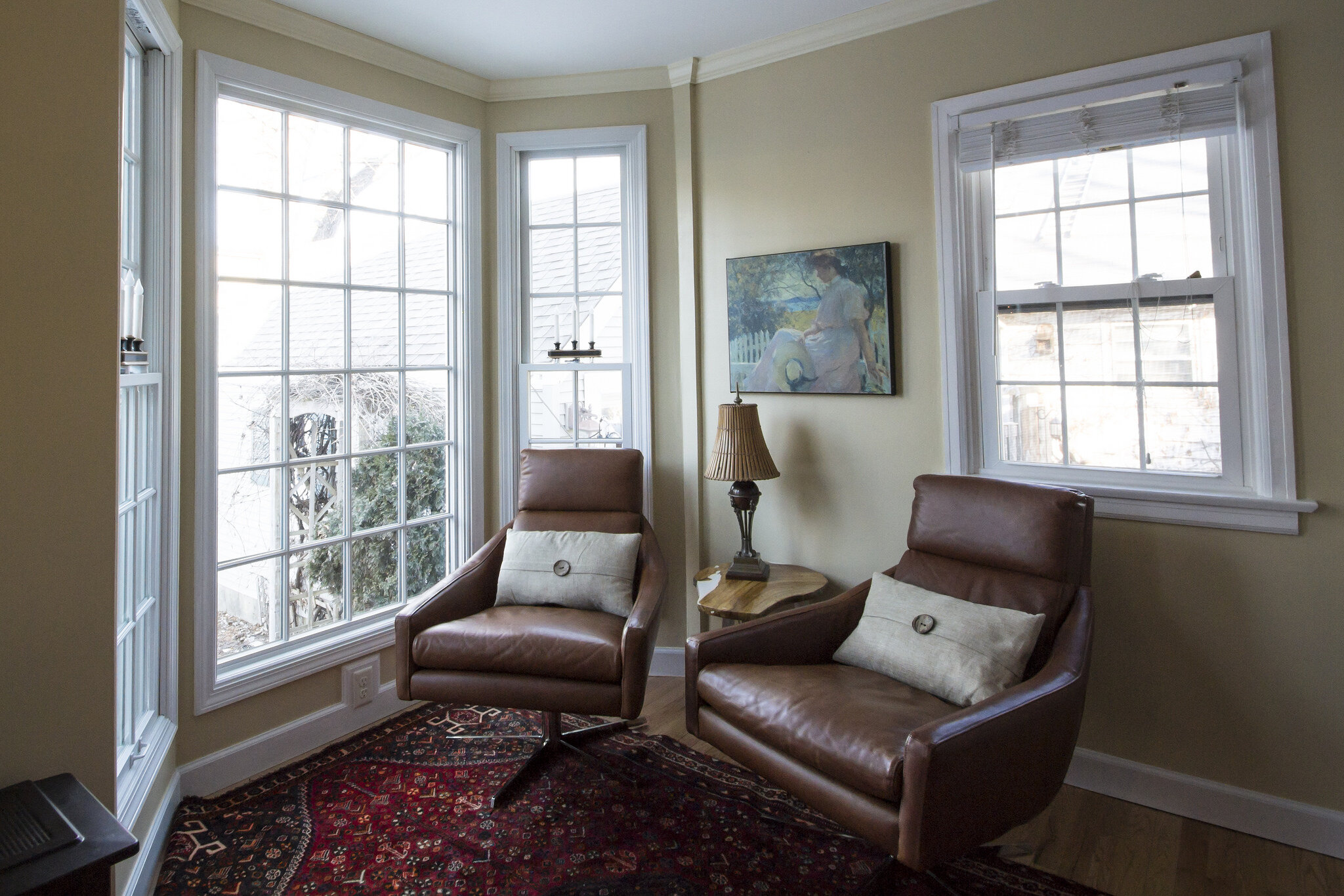
Portfolio Photography
Environmental photography of finished projects.